Starting a design with accessibility
Table of Contents
Designing with accessibility in mind from the start is even better than reviewing a design for accessibility. It helps us consider the wide range of people who use our products and services.
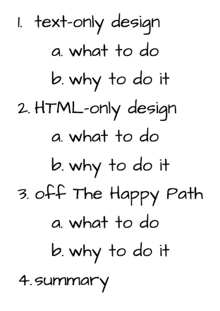
Here are three things we can do to start a design with accessibility.
Do a text-only design
Doing a text-only design to helps us clarify the order and content of a page.
What to do
We can write out the design in text before opening up our favorite design tool (like Sketch or Figma or Adobe XD). Start by making a numbered list with pen and paper, or in a text editor.

Write out the:
- Section headings,
- Content and function of each image,
- Text of each link,
- Text of each button, and
- Name of each form element.
Why to do it
Writing the content in a numbered list lets us be clear on:
- The source order of elements in the HTML. This is the order that a screen reader will read the page in.
- The hierarchy of elements on the page. This helps us make choices about layouts on different screen sizes.
- The focus order of the page. This helps us make sure it's logical and meaningful.
Writing headings lets us divide the page up into logical sections. Screen reader users often use headings as a way of navigating around a page.
Writing the text of images means we’ll already have alt text (or something that’s a good start on it). It helps us be clear on what information (if any) the image is conveying.
Writing the text for links highlights why “Click here” isn’t helpful link text. Link text should describe where the person goes when they follow the link.
Writing the text for buttons highlights why "Submit” usually isn’t helpful button text. Button text should describe what happens when the person presses the button.
Writing the names of form elements forces us to think of good labels. It forces us to think about the clearest name for each element.
Do an HTML-only design
Doing an HTML-only design helps us clarify the order and content of a page. It also helps us clarify the single function of each interactive element on a page.
What to do
Go through the text-only design and expand it to use only HTML elements. No CSS at this point! That means no presentation (except things with defaults, like heading styles) and no layout (everything will be in one column). MDN's HTML elements reference has a grouped list we can use to find the correct semantic element.
Why to do it
- Designing with only HTML gives us the same benefits as writing the page out in a number list. The source order, hierarchy of elements, and focus order of the page are clear.
- We can only use one element for one thing, so it forces us to decide what each thing really is. For example: is this a link or a button? If it’s for navigation, use a link. If it’s for an action, use a button.
- Designing with HTML forces us to decide on the function of each thing (however we end up styling it). For example: is it a multiple-choice question where we can only pick one? That’s a group of radio buttons.
Go off The Happy Path
“The Happy Path” is the “everything went well and nothing went wrong” scenario. While this is a nice idea, it doesn’t represent the real world and how people and computers interact.
What to do
Review the design and try and break it. Now annotate the design with how to help the person using the page. Can we improve the labels of fields? Can we add help text for fields? What error messages can we show that will tell the person what went wrong and how to fix it?
At this point we could review the design with some presentation applied and consider the CSS we would use. Adding presentational elements will give us more things to check, such as:
- Use of color to convey information.
- Contrast ratios.
- Animation and timing.
- States of interactive elements, such as focus styles.
One nice way of trying to break the design is to approach it from a very different direction.
- We can ask ourselves “if I was trying to do this wrong on purpose, what would I do?” For example: imagine not entering data in any required fields, or entering the wrong format.
- Pick an element and flip, try the opposite. For example: if an error message uses colour, check what it would be like without colour.
Why to do it
Going off the Happy Path forces us to:
- Consider error states explicitly. It makes us write error messages up front.
- Think about the wider range of human experience. It helps is realize where we might be adding barriers by making assumptions about a person’s abilities.
Summary
Reviewing a design for accessibility is a good way to make sure we ship accessible experiences. Starting a design with accessibility is even better.
Three steps we can start a design and consider accessibility are:
- Do a text-only design,
- Do an HTML-only design, then
- Go off The Happy Path.
This helps us to think about the diverse and complicated range of people who will be interacting with our designs and code. It helps us make sure that we don't put up any barriers for them.