Are you making these five mistakes when writing alt text?
Table of Contents
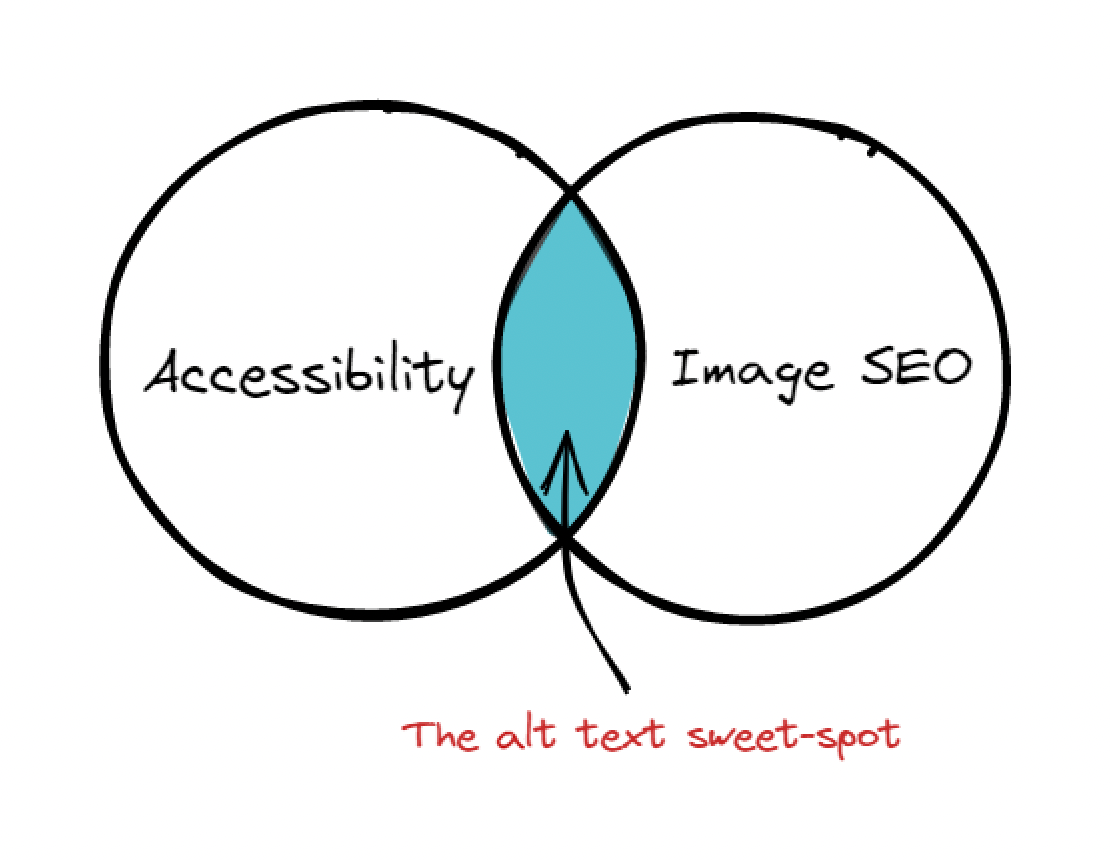
There are many benefits to writing alt text for images, especially from accessibility and legal standpoints.
But most don’t know how to write alt text well. I should know because, for an awful number of years, I was one.
I first learned about alt text in high school while building websites. But my proper lesson began when I took the Udacity Digital Marketing Nanodegree course, which was also my first introduction to marketing.
In this module, I learned about building easy navigation site structures, title tags, breadcrumbs, and meta descriptions—all the good stuff. We also learned about writing alt text and its importance.
Their overall advice? Describe what you see.
I thought that I finally understood it.
Sometimes it is simplicity that kills
When you ask them, most experts’ advice also boils down to: Describe what you see. And while it’s valid advice and may seem simple, it’s not.
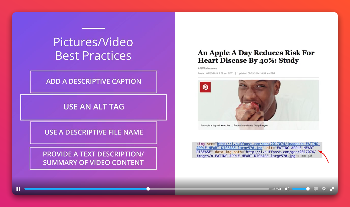
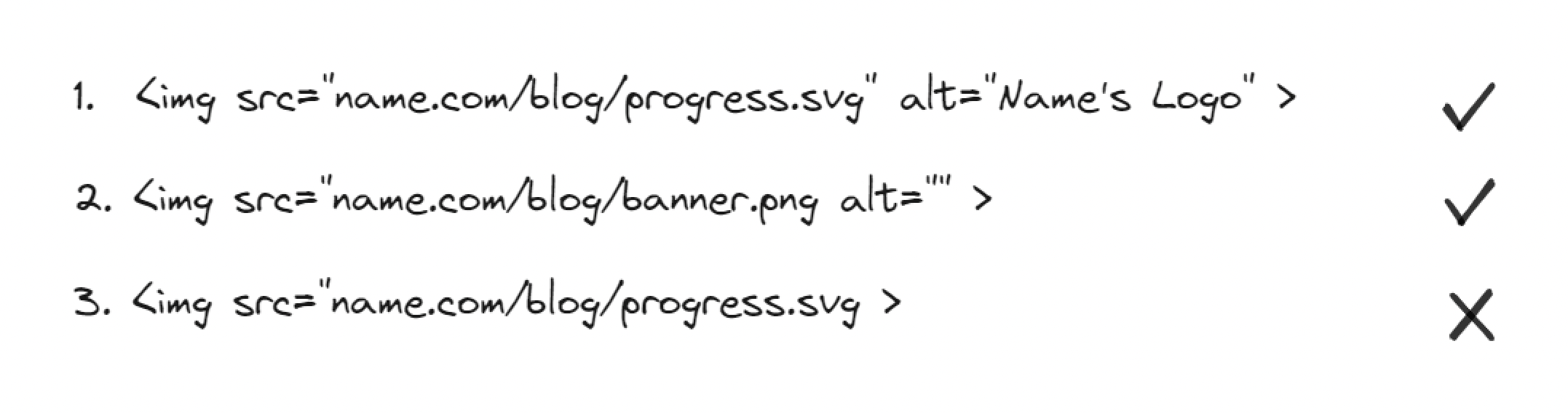
Take the Udacity example earlier: Is this suitable alt text?
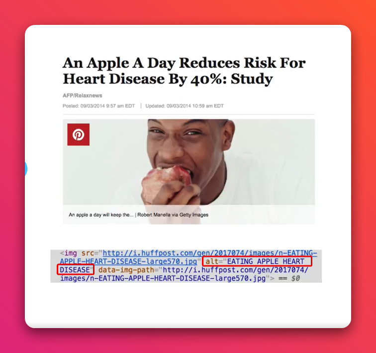
If you close your eyes and someone reads out the words “eating apple heart disease” to you, does that in any way help you make sense of what’s in the image?
What about this example?
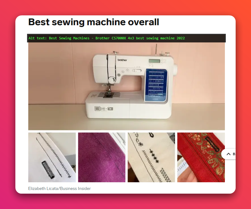
Does it?
The answer is a big no.
I used to just describe what I saw
Then two weeks ago, I watched Tommy Walker, an ex-Shopify senior content marketer and editor, critique an article for its alt text usage.
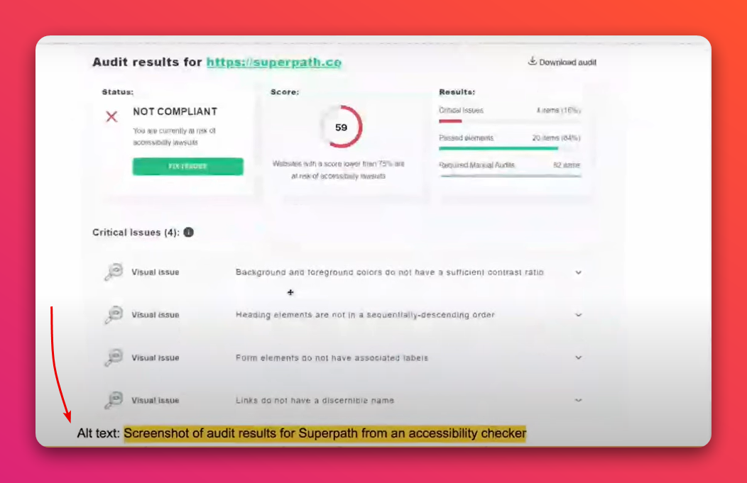
Notice that the alt text does not communicate what the audit results are. Ironically, the article was arguing for accessibility. But it made the point clearer. And for the first time, it dawned on me that I’ve been writing alt text the wrong way.
This got me curious, so I started researching:
- I read numerous UX and SEO blogs,
- I spoke with practitioners in those fields, and
- I chatted with some members of the low vision community.
Here’s what I learned and what I’m now applying to the articles I write:
1. Some images should use an empty alt attribute
First, to clarify:
- An
altattribute is HTML syntax, and - Alt text is the description enclosed between the alt attribute's quotes.
All images need an alt attribute, but not all images need alt text. These are two different things, so do not mix them up.
So how do you know whether an image needs an empty alt attribute? The decorative/informative/active approach.
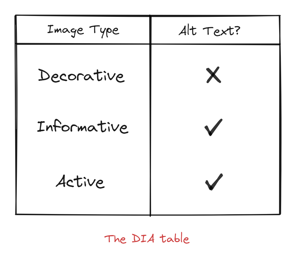
A short overview
Following is an overview of different types of images, and how to best describe them.
Decorative images
Decorative images' only value is aesthetic. If they are removed, the webpage would still make perfect sense.
Some examples are website banners that have no text in them and other design elements. You should omit the description for this type of image, but always include an empty alt attribute.
<!-- Sample decorative image -->
<img
  alt=""
  src="decorative-banner.png" />
Informative images
Informative images add extra context to the information presented in the article.
A few examples are graphs, diagrams, poll results, and product screenshots. Pay attention when describing them. You will learn how as you read on.
<!-- Sample informative image -->
<img
  alt="A small, black, compact digital camera."
  src="product-photo.png" />
Active images
Active images are used to perform actions such as signing up, downloading, listening, uploading etc.
They are mainly links and buttons. When writing alt text for these kinds of images, avoid terms like "Click here".
Instead, use descriptions like, "Sign up for a Twitter account", "Go to the account page", "Upload your national identity card", and so on.
<!-- Sample active image -->
<img
  alt="Upload resume."
  src="upload-prompt.png" />
2. Context matters
Alt text should concisely and accurately describe the image's content. If you have an overall point to make, let the surrounding text content communicate it.

For example, this image could be used for:
- Helping to identify a business listing,
- An exposé about an unscrupulous used car business,
- A commercial real estate listing, or
- A political campaign promising commercial revitalization.
It is up to the reader to decide how they feel about something, and alt text helps provide them the full context of the story.
This is useful not just for accessibility but also in competitive arenas like SEO where you’re competing with behemoths like HubSpot, Databox, The New York Times, and Zapier.
3. Screen readers and search engines already know that it’s an image
There’s no need to add in "image of", "picture of", or "graphic of". That only leads to repetition which can be annoying for listeners, particularly if the article contains a lot of images.
Instead, use the extra characters to convey information better.
I love the simplicity of the next one:
4. Write alt text as simple sentences
A dark practice among search-engine optimizers is stuffing their target keywords into their images’ alt text. This is a terrible user experience.
The shocking reality?
Google’s John Muller has repeatedly said that alt attributes don’t affect normal Google search.
Besides that, if you think that you need to stuff your alt attributes with keywords, you’re starting on the wrong foot and Google is coming for you—just like it did for Overstock, BMW, and even Google Japan.
Screen readers like JAWS and NVDA read alt text aloud a lot like the way that we read sentences aloud. So you should format your descriptions as regular sentences with proper punctuation and spelling.
There is no one formula for how long alt text should be. You should concisely and accurately describe all important and relevant details present in the image.
In the cases where you need to describe a complicated graphic such as a chart or graph from a research study, consider following the W3C tutorial for dealing with complex images. Note that the longdesc method is no longer valid, however (reference the link's Notes section).
5. Don’t repeat captions in alt text
Copying captions verbatim into alt text is a popular practice in e-commerce because marketers think that that’ll help with their search-engine rankings, but that actually creates a bad user experience.
This is because screen readers end up repeating the same words. Imagine this happening for two, three, or even five images and you can quickly see how the experience goes downhill for people with disabilities.
Captions and alt text serve a different purpose. Captions are typically used to add details such as photo credit and copyright information. Alt text should describe the image’s meaning in the context of the article instead.
You can omit captions, but the same can’t be said for alt attributes.
Writing alt text might at first feel overwhelming or unproductive
For some, it may feel like you’re spending extra time and money on a small percentage of your user base and readers. So you may feel an urge to overlook alt text.
Setting aside exclusion and discrimination for a moment, this isn’t a risk you want to take on a company’s site. Because ignoring alt text is a recipe for disaster.
Target wished they had known earlier because it cost them $6 million in damages. When Netflix failed to take a cue from Target, it cost them $755,000 in legal fees and damages. The list goes on.
Even more, there’s a growing population of sighted people who use text-to-speech software so they can multitask or take a break from staring at LED screens all day long. Failing to make your content accessible will lead to a bad user experience.
It’s also a chance to get featured on the internet hall of fame
On some sites, a third of their traffic comes from Google Images. Doing alt text right is how Hubspot drove an extra 160,000 traffic sessions to their blog.
While it can feel like there’s much to learn just to make your website accessible, my advice is to not overwhelm yourself. Instead, take it step-by-step, and understand the basic purposes of alt text, which are:
- Making it easier for screen readers to accurately describe images to the people who rely on them,
- Appearing in place of the image if it fails to load, and
- Helping search engines understand the graphics on your website.
Do you know what’s even better?
- Hanging out in their communities,
- Reading their rants and comments, and
- Listening to a screen reader like NVDA and learning how exactly it works.
We can hypothesise as much as we want, but nothing beats walking a mile in readers’ shoes. You will learn more in an hour or two doing that than you will reading guide.
Appreciation
Credits to Cierra Loffins. She did most of the legwork for this article.